Wednesday, 24 April 2013

Documentary Modes.

                                                       DOCUMENTARY MODES

Expository Mode
This mode of documentary is what most viewers will recognize. Verbal commentary is critical to this form of documentary, as well as an assertiveness in its claims, often voiced by a narrator with an authoritative tone. The expository mode is often found in television news programming.

The expository mode of documentary filmmaking chooses an argument, and a "right" answer with a preferred meaning. This is often directly addressed to the audience, the point is clear and concise and the narrator does not encourage the viewer to question the conclusion.
John Grierson's work is a good example of the use of the expository mode of documentary filmmaking. Many nature documentaries employ this mode. 

Think of someone exposing themselves as "natural" to remember that the expository mode is used a lot in "nature" documentaries. Or think of a less gross way to remember.

Nudist BBQ = Expository mode of documentary film making. Obvious connection.

The Poetic Mode - (subjective, artistic expression).
The poetic mode of documentary shies away from the "objective" reality of a certain situation or people to gain an "inner truth" that can only be attained by poetic manipulation. It emphasizes descriptive passages, rhythmic or tonal qualities, visual associations and favours mood, tone and texture.

A good example of the use of the poetic mode in documentary is "Man of Aran" (1934) by Robert J. Flaherty. It employs dramatic framing and presents an exaggerated image of a man at one with nature.

Leni Riefenstahl's "Olympia" (1938) represents the Aryan athletes during the Olympic Games of 1936 as successful, beautiful and perfect - all exaggerated highly to excessively promote the Aryan race.

Not to be confused with downright lying. Although Robert J. Flaherty has been given (a little too leniently) the excuse of employing the "poetic mode" of documentary film making, I'm certain that if someone studied the law extensively enough, they could find a clause that meant anyone who has ever seen "Nanook of the North" could sue Flaherty for being a fraudulent, lying (expletive).

I will be devoting an entire article to this big fat lie later.
 

The Performative Mode - (the film maker actively participates during the filming)

This mode of documentary particularly focuses on the subjective nature of the documentarian and also acknowledges the fact that the audience can view the film subjectively. The idea of objectivity is replaced by "evocation and affect"

This mode accentuates the emotional and social impact on the audience. Michael Moore adopts the performative mode in a lot of his work. 
 
An example of the performative mode is Morgan Spurlock's "Supersize Me" (2004).


  The Reflexive Mode

The reflexive mode recognizes the constructive attributes of the documentary, but does not hide it. It admits to the viewer that this is not necessarily the "truth" but an accurate representation of it -"a" truth not "the" truth.

The artifice of the documentary is not hidden, the audience is well aware of the editing, sound, recording and reconstructions - many of which, are often used in this mode. There are even times where see the film being constructed within the film.

Dziga Vertov's "Man With A Camera" (1929) presents the industrialization of Soviet life in the late 1920's. The mechanical camera and the cameraman become part of the content.


The Observational Mode

The Observational mode of documentary film making is best exemplified by the Cinema Verite (aka the Direct Cinema Movement) which developed in the late 1950's/early 1960's in an attempt to record objective reality as accurately as possible, with the film maker as an unbiased observer. The film maker is a witness rather than a participant.

The filmmaker is hidden behind the camera, does not interact with the characters being filmed and is ignored by the subjects. The filmmaker does therefore not influence the actions of the subjects and the events being captured.

In the observational mode, nothing is staged or set up and the camera has to rush sometimes to keep up with the action-taking place. This sometimes results in shaky, amateur looking footage, a great disadvantage to using the mode of documentary making.
 
A good example of this mode is Frederick Wiseman's "Hospital" (1970), which aimed to capture the daily drama of a hospital as accurately as possible.

Richard Pennebacker's "Don't Look Back" (1967) is also a good example of this mode, in recording Bob Dylan's 1965 tour of Britain.

The Participatory Mode:

In total contrast to the observational mode, the participatory mode embraces direct interaction between the filmmaker and the characters of the documentary

The filmmaker openly becomes part of the events being captured. The filmmaker's influence on the events is acknowledged and is often also celebrated.

Michael Moore often adopts the participatory mode in his work, he openly engages with the characters, and essentially becomes a character during the filming.
Martin Bashir's "Living With Michael Jackson" (2003) is an example of the participatory mode being used.

As is "Kurt and Courtney" (1998) by Nick Broomfield (who often adopts the participatory mode in his work.)

Louis Theroux antagonizing everyone he comes into contact with while making his documentaries is another example of the participatory mode

 
"On the other hand..."


As is John Sweeney huffing and puffing during filming "Scientology and Me" appearing to be trying to blow the interviewee's house down.

"YOU SHALL NOT PASS!!!"


Thursday, 18 April 2013

Three Point Lighting.


Three point lighting is a technique used in various forms of media. As I have mentioned before, editors and lighting technicians have been coming to blows since the beginning of film. Used in film, photography and even CGI imagery, this technique has become a standard practice in many sections of media production. The name "three point lighting" comes from the fact that while using this technique, the media maker will place three seperate lights in three separate positions, in relation to the character being filmed or photographed (Captain Obvious. 2013. pg12). This means that the character on screen can be illuminated, however desired. It also means that the shadows within the shot can be controlled by placing the lights in the appropriate direction.
 
3 point lighting: Notice there are three lights.
Out of the three lights used in this technique, the key light is usually the most important light that a cinematographer will use during this lighting set up. There are different ways to optimize the use of a key light, but while using three point lighting, it is positioned at a 30–60° angle, the beam directly reaching the character being filmed, and acts as the main source of light for the shot. The key light dictates the lighting design, which we will keep in mind during filming, as we will need to take into account the strength, angle and colour of this light as it effects the entire aesthetic of the shot. Imagine it this way, the key light is the lead singer.
 
Just for the love of God don't imagine it's Morrissey. You don't want to end up attacking the equipment.
You will need to take into account several factors when setting up a key light. The location of a set is crucial to the set up of key lighting. When filming outdoors, should the weather conditions be bright and clear, artificial light is therefore unnecessary, and the sun itself can serve as a key light for the film. A disadvantage of this is that the scene composer cannot adjust position of the main source of light, and you should be weary of this - you do not want to be waiting outdoors for the sun to position itself in a suitable place for us to film under it.
 
Original key light baby...
The fill light in the three point lighting system, is used for the purpose of decreasing the contrast of the scene, and to decrease the strength of the shadows within the frame. The fill light is usually softer than the key light, but the ratio between light and shadow depends on the intent the film maker has for the scene. It is placed at a side angle to the key light, often below it, at the level of the subject's face - this will be crucial to master if you are interviewing someone for instance. Placing the fill light here allows for more balanced light distribution, as it illuminates surfaces that are covered by shadow, lessening distracting chiaroscuro effects, such as the shadows cast by the nose on a character's face. If you neglect to use a fill light, your project could have shots full of harsh contrast. Fill lighting is all about distraction: The use of fill lighting can subtly make a documentary appear less staged and more investigative. Think of the fill light as the bassist evening out a song.
Hello, I'm Flea, and I'll be your fill light today.
However, also understand that you can also use a reflector should the use of lamps become too potent in the scene. If there is too much light involved in a scene, a reflector can act as the fill light instead of an actual lamp. This has an added benefit of more subtlty, which will make your set appear more natural, more "real" and less set up. You will need to explore and become practiced at using both options in order to gain the best possible fill light.  So a reflector can be like a bassist minus the music...the reflector is Bez:
 
Look up the Happy Mondays if you are taking GCSE media.
The last light included in three point lighting, is the back light. This is placed behind the character in the scene, giving the subject an outline of light, separating the character from the background of the scene. This is important as you can use this while filming to encourage the audience to focus on the character in question, as this subtle lighting technique makes the character physically stand out more to the audience.

According to Gerald Millerson, an expert in studio production:
“The scene must be illuminated to show exactly what is wanted, but the audience should not be aware of the lighting.”
And I'm the back light. Because I'm at the back.


Interactive Advertising.

Interactive Advertising: You cannot afford it. Well that isn't strictly true... you can afford distributing leaflets on a rainy day, annoying people in the street. But you can't afford one of those boards where Timon and Pumba tell you a story and make you feel like a child again. Not even if it was your dying wish would somebody give you one of those boards you see in the Disney Store for free, or even for a reasonable price.

But... it's a good thing to know about when it comes to advertising a media product. Not only does it show you understand how important interactivity is when it comes to customers, but it shows you have a certain technological literacy if you take the time to study how the boards actually work. It also shows you are looking
He knew his interactive advertising.
at how other companies advertise. Even if you hate business, it is a sometimes unavoidable place to land in when working in media.


A fairly new advertising technique in many forms of industry, interactive advertising is regularly utilized using online and offline interactive media to sell products, promote companies and target audiences effectively. The media industry is familiar with this, and when used it is in effect "the media advertising media" - a quip that might make your lecturer, or boss laugh if they're having a deliriously good day.

The Media....advertising...MEDIA...


Technology and research company, Forrester, states that by 2016, online advertising spend will be equivalent to television spend currently. However, Interactive advertising takes many forms and should not be mistaken to be exclusive to the internet, although it is common to find this advertising technique in cyberspace.
"Pop-up disappearo!!!"

As a matter of fact, you have probably shouted at a lot of these adverts when trying to watch the latest Harry Potter film, and suddenly a target appears over Hermoine's face, with a voice claiming that you will win an iPod if you hit the target. THAT is a form of interactive advertising.


Offline interactive advertising methods are much less annoying and can be rather fun. They include direct sales calls to telephones, visits to a person's home (performed by a "door to door salesperson") but here is the REALLY fun part -  interactive kiosks with touch screen monitors, interactive television, etc! 

Telephone calls however, are the oldest form of interactive advertising, but do not start badgering innocent strangers by telephone just yet - firstly, not being licensed or trained to do this is a crime, secondly, it's ill advised to harass or annoy potential customers by telephoning them in the middle of dinner. I've been a telemarketer, believe me, it annoys people to the point of them cursing you and all that you hold dear


Online interactive advertising takes many forms, including blogging, email marketing, key word optimization and social networking. Because of the rise in both internet technology and usage, online interactive advertisements have become a popular form of marketing. As I have already mentioned, do not resort to pop ups - this can be - hell, this IS annoying and you do not want to become accused of being a computer hacker because your advert distressed the once potential customer out so much they mistook it for an elaborate computer virus.

..."WHHHY?!"

Creating a blog is free, and effective - some bloggers even get paid for their services by companies wishing to advertise via them, proving the efficiency of this method of marketing. Almost everyone, including my luddite, technologically illiterate great-great uncle understands what a blog is, and while you may not be able to advertise on blogs due to your budget, you can certainly set up your own blog promoting your product, and advertise this blog via social networking and email marketing - both of which are free services to those with an internet service provider.


Email marketing refers to the advertising method of sending promotional emails to many internet users. Emails could include information regarding the company, offers and discounts on products, or a website URL. This is a tactic you could use, as with email and the amount of people who use it, you are very capable of reaching a wide variety of people who may in turn forward your emails to others, further promoting your product.


 It also will unlikely exceed your estimated expenses or exhaust your resources. Another advantage of email marketing is that this method is considerably faster than printing out and distributing leaflets, due to time needed when producing the artwork for the leaflets and handing them out which can also be time consuming. It will also save you walking around busy shopping centers receiving a whirlwind of abuse that only telemarketers and those distributing leaflets to the busy and grouchy public will understand. And I have done both of those jobs. Waiting for my application for sainthood to go through as we speak....  anyway, do not abandon the idea of producing leaflets to advertise your product because although response rates are often very low with leaflets, it is not terrifyingly expensive to have them produced. However, in regards to email marketing you should seriously take into account that a fair percentage of internet users simply ignore or delete emails that are simply advertising (referred to many if not every single email user out there as "spam") so although it is possible to use this method, do not rely solely on email marketing to promote your production and find your niche.
So...what are you saying exactly Internet?


Interactive advertising has the advantage of being able to target the intended audience more carefully. Badly coordinated advertising results in poor sale of the product it is trying sell, possibly a reason why more and more companies are including the interactive approach in their advertising plans. In other words, they got fed up with all the abuse they were receiving from disgruntled customers who only wanted to mind their own business while telemarketers and leaflet distributors hung around them like a bad smell.  Interactive advertising allows a company communicate directly with both existing and potential customers. It is also usually a very effective way of holding a potential customer's attention. 

....*ping*
   
Social networking is a recent and one of the most significant methods of online interactive advertising. The social networking site facebook (like you're not wasting time on it now...) as of September 2012, has over one billion active users - a good place to search for potential customers due to the vast number of people viewing the network regularly. It is free, easy to maintain and facebook groups are known within the world of advertising to quickly grow in volume, something to take into account. The advertising companies know that people frankly never leave that site alone, and decided to declare it their hunting ground before the World figures out how to log off facebook.


Facebook addiction...serious business.
Interactive advertising gives companies an opportunity to become very creative with their promotions. For example, Disney implemented interactive advertising in many of their stores worldwide by placing inside the stores interactive mirrors, which upon first inspection appear to be normal mirrors but then suddenly a computer generated image of a Disney character appears with audio to tell the customer a story. This particular form of interactive advertising is aimed at children to reinforce their interest in Disney characters, and thereby the products. It is also aimed at adults who will be drawn to the products of this particular kind of advertising because they can see how the mere advert itself has pleased their child. It is impressive, how direct this form of marketing is and although you probably have limited means of producing adverts like this, it is good to study creative and direct marketing - that is usually the marketing that works.

Admit it. It looks fun.


Other examples of offline interactive advertising include interactive billboards that many prestigious companies have released as part of their advertising campaign. Interactive billboards are advertisements that act as television screens, some which recognizes movement in the viewer and imitates this, as fashion company Diesel's design did. Other companies such as Adobe Systems Incorporated, Chanel S.A, Foot Locker Inc, etc have made use of interactive billboards.


It is good to appreciate once again, that you probably do not have the means to produce adverts as expensive and technologically advanced as this, but these adverts all show extensive creativity – something I have learned is highly beneficial to creating an effective advert. A good thing to bring up in conversation with your lecturer or boss, to show ambition, creativity, technological prowess, etc. Nobody is demanding that you make one of these, but trust me, this is an all around good thing to know about in the media industry.
As more company's focus their efforts online, it is becoming critical to the success of a product to advertise it online. Thankfully that a lot of online interactive advertising methods are free and easily accessible, and nobody is demanding that you pull Disney Store like adverts out of thin air. The use of the internet is growing consistently, and you as media promoters must take advantage of this fact if you wish to reach your target audience. 

While technology and an unlimited spending budget is certainly useful in advertising: Creativity is still essential.

Tuesday, 16 April 2013

Using Artificial Lighting Correctly in film.


Artificial lighting can be the making or breaking of the aesthetics of a film. Also used in photography (an article I will soon be writing), the use of artificial lighting will benefit your film if you learn to use it correctly. Media students, film students, those who are interested in becoming lighting technicians: this is for you.
When taking the use of artificial lighting into question, as a lighting technician, you must first read the script of the film several times to achieve an appropriate lighting plan. If not, you may clash with the director and writers in regards to their vision. The director and the lighting technician should both be clear about what the lighting plan is, to avoid any conflicts or misunderstandings on set. And let's face it, there is going to be PLENTY of  friction on set already, because...it's a film set. It it advisable to be keeping this in mind when filming, keeping the director in particular aware of any plans the lighting technicians have for the scenes being filmed. 
See these? Learn what they do!
As I have mentioned before, lighting technicians will get the blame for any shot that looks badly composed on green screen. This often applies in other styles of filming as well. Make no mistake, the editor will hunt you down, the director will blame you until the end of time and the DOP will get away with murder, insisting they could not produce aesthetically pleasing shots due to your incompetent lighting plan. The only way to avoid another media hate crime against lighting technicians with you as the victim, is to study the use of lighting extensively.
 
I will not mess up...I will not mess up...
Regarding the practical aspects of the use of artificial light, you will have to take into account any available light if there is any. When possible, you should  use the available light in the most efficient way you can, adding additional lighting when necessary. For each scene, it is a good idea to set up the camera to see what exactly needs to be lit during the shot, this way you could avoid wasting time lighting areas that will not be shown in shot. In doing this, you will avoid the director, the DOP and anyone who wants to get home on time, screaming at you and belittling you even more than usual.
Once you have understood how potent the natural/available light is, you should be able to build your three point lighting system around it. Take photographs of the set to get a clearer idea of what will be seen on film, and how much lighting needs to be added (if any).

 
Extensive: An example of a lighting plan.
 Keep in mind that what appears on film often appears different to what appears to the human eye on set, and that you will use lighting to gain the visual we want for the film.


Despite the possibility that you may need artificial light to brighten the images you record for the film, you must also consider the fact that the artificial light you may employ may be too harsh or too bright to work with. After consulting the e̶m̶p̶e̶r̶o̶r̶ director about this, should the problem arise, the good lighting technician will apply soft boxes to the light heads if the artificial light source in use is too harsh. 
Softboxes to counteract harsh artificial lights


Lighting technicians can also use artificial light to create directional lighting, by putting the barn doors on the light head to point the light in the direction it needs to be shining. Which brings me to my next point; lighting technicians must be trained and experienced, for one reason being that when adjusting the barn doors on a light, gloves must be worn due to the bulb possibly becoming very hot. Also, a lighting technician that is inexperienced could possibly break the lights as well as injuring themselves, which is why those responsible for lighting must be trained and careful with the equipment. 

If you are not a lighting technician, and have, for example, been pressured into taking on the role as lighting technician, by say, a student at your uni who has been producer for all of ten minutes and has already let the power swarm to their head - do NOT take on the role without undergoing the appropriate training to use the equipment. Any responsible university lecturer, or indeed any competent lighting technician will say exactly the same thing.  
Artificial lighting: An unnecessary wound.


A long and arduous task this can sometimes be, to give yourself a better chance of achieving good lighting on set is to simply do it shot by shot. That is, every time the camera is moved to a different angle, the lights must be moved to correspond with the shot and ensure that the subject is lit appropriately. This sounds like a long, thankless task, but believe me it is not. Once you have achieved a scrupulous and workable lighting set up for each shot, it will contribute to the success of your film and if you are a student, notice how other films will get criticized for lazy use of the lights. 
Lighting: even useful outdoors in broad daylight.
There are ways around the time consuming nature of setting up lighting. For example, a lighting plan can save a lot of time on set. Using this will mean that you can shoot in the order of lighting set ups rather than the chronological order of the scripts. If you feel uneasy about suggesting this to the director, just remember, that this will save a lot of time on set and the rest of the cast and crew will appreciate how efficient mindful you are by bringing this up.

Your attention to the precise detail of lighting will be noticed. Although trying to get the best out of the lighting is a main reason why filming takes so long on set, the rewards will be obvious when the finished product is delivered. It's worth it, make the effort.


Working with Green Screen (and avoiding a nervous breakdown in the process).

As someone who was once a media student, I understand wholeheartedly how panic-inducing working with green screen is if you don't understand precisely how it works. During filming, it may appear to be fine, why it may even be fun - but whoever is in charge of post production will swiftly place a bounty on your head if you present them with footage that appears to have a lighting set designed by a sleep-deprived baboon If you happen to be editing footage like this, nobody who has ever been in that situation would judge you for crying.



Firstly, lighting is crucial to a successful green screen film. Crucial. I truly cannot emphasize enough that an inexperienced lighting technician looking to experiment should not be taking risks with the lighting on a green screen set!  While using green screen, a 5 point light set up is ideal. You will need to have enough light to light up the backdrop completely, as well as the character. If there is not enough light on the backdrop, shadows or hot spots will appear, which are difficult to key out during the editing process. If your character is not lit well enough, they will actually start to disappear into the background once the editor begins keying, because there is not enough definition between the character and the green screen. 
 While working with a green screen, to be safe,  it advisable to aim to have a 5 point light set up if possible, in order to get the most “key-friendly” footage. In post production, poorly lit green screen could lead to your actor disappearing into the background, the foreground being grainy or under-exposed, and being faced with a giant shadow that just won’t key out. I have learned from experience that disappearing characters and obnoxious shadows can turn a once peaceful human being into the Incredible Hulk, cursing obscenities at Final Cut Pro before running screaming into the night to find that "(expletive) lighting technician".
The most basic way to appropriately use this 5 point lighting system is to keep the key, fill, and backlight in relatively the same position as you would have them in a 3 point lighting set up. With the key being the brightest light, position it at about a 45 degree angle from the camera, facing the character. The fill should be on the opposite side, at a lower intensity, and still at that 45 degree angle from the camera. The backlight can be positioned behind and slightly to one side of the character, so it frames the subject and is out of the camera’s view. The other two lights you can use to light the backdrop. Placing one on either side, but letting the beams cross each other so that the light seems to just flood the background.

If you have a character that is lit perfectly with 3 lights, then a three point lighting system may be all that is required. However, the more characters in the shot, the more lights needed. That is basic green screen algebra - More Characters = more lights. The wider the shot, the more light needed. If you decide to create any sort of mood lighting, or emphasize certain props or aspects in the shot, the more lights you shall need. 
Notice how "LIGHTS" comes first...

Three point lighting is a technique used in various forms of media. Used in film, photography and even CGI imagery, this technique has become a standard practice in many sections of media production. The name "three point lighting" comes from the fact that while using this technique, the media maker will place three seperate lights in three seperate positions, in relation to the character being filmed or photographed. This means that the character on screen can be illuminated, however desired. It also means that the shadows within the shot can be controlled by placing the lights in the appropriate direction.
Out of the three lights used in this technique, the key light is usually the most important light that a cinematographer will use during this lighting set up. There are different ways to optimize the use of a key light, but while using three point lighting, it is positioned at a 30–60° angle, the beam directly reaching the character being filmed, and acts as the main source of light for the shot. The key light dictates the lighting design, which we will keep in mind during filming, as we will need to take into account the strength, angle and colour of this light as it effects the entire aesthetic of the shot. You want the key light to illuminate the actor in a way that eliminates shadow and works well with the other two lights to create even lighting, a crucial element in a successful green screen production. Which I am quite sure I have mentioned.
When God said "Let there be light"...he meant for green screen.

The fill light in the three point lighting system, is used for the purpose of decreasing the contrast of the scene, and to decrease the strength of the shadows within the frame. The fill light is usually softer than the key light, but the ratio between light and shadow depends on the intent the film maker has for the scene. It is placed at a side angle to the key light, often below it, at the level of the subject's face - this will be important to master for your green screen so that you can illuminate the subject appropriately in order to make them correspond with the back plate.

The last light included in three point lighting, is the back light. This is placed behind the character, again, to correspond with the image on the back plate (for instance, if it is a cold, blue light, we will use an appropriate filter on the back light to give this impression).

It is a common misconception that when using green screen, to get the best result it is wise to shine as much light at the green fabric. This is certainly not the case - the most important part of getting a successful green screen shot, is how the subject in front of the green screen is lit, and how consistent that light is with the back plate. The film, Sin City, is an excellent example of how to use lighting when using chroma key. And a good film to boot.
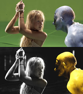
A good use of green screen.
 When using green screen it is very important to check what lights or light sources are present in the image that are scheduled to be placed upon the back plate in post-production. Far away lights in shot, (for example, lamp posts if the character is meant to be walking down the street at night), will give the scene a hard back light, whereas nearer lights such as a lamp post the character is standing under, will illuminate the character more rather than the back ground. All light sources in the image to be placed around the character using green screen must be taken into consideration in order to provide consistent lighting for the shot in the studio.

Oh editors...my heart goes out to you.

  A good way to understand how the lighting is going to be effecting the subject in question, is to have a member of the crew hold their fist in the air, (have someone put Van Halen on to pump your fist to if you feel silly doing it in silence) while blocking out light with the other where the character shall be standing. This blocks off one light in order to see how the light from all the other angles are effecting it. Once the shots have been decided, and how the subject is going to interact with the background, it is important to ensure that the subject being filmed does not go off the edge of the green screen. Remember - if the subject goes off the edge of the screen, the editor will go over the edge in post production. And we love our long suffering editors.
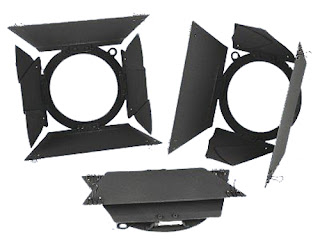


The most even light possible, with as little shadow as possible, is what should be aimed for when working with green screen. You should try, if possible, to make sure that the lights in your production are behind the subject, to ensure that they create as little shadow as possible on the back plate. Because of their flexibility and powerful beams, dedo lights are ideal for using when working with green screen. The power of the beams are adjustable, and they are mutli-directional. However, be weary of barn doors possibly creating patterns on the green screen, and potential hot spots from the powerful beam.

Once the lights have been set up and switched on, it is advisable to take photographs of a subject in front of the back plate, run the photos through photoshop and turn the contrast of the image down. This will allow the crew to see any dark areas or hotspots that are in need of correction in the set up, that may not be visible by eye. This saved us a lot of time and stress when I insisted on doing this to my crew for our first green screen project.
If you do not have a lot of distance in the studio, some lamps may be too big for your production, the beam too powerful. Especially if you are media students, trying to keep the rest of the class at bay as everyone is waiting their turn to use the studio due to booking the studio at the very last minute. I understand, there were parties I simply couldn't miss out on either. When I was a student, we were very limited to the kinds of lights we had access to, but there are ways around this if the lights we booked proved to be too powerful. 
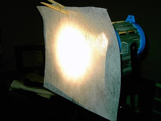
Tough Spuns: WORTH GOOGLING.

 
Tough spuns for example are not that expensive, are fire proof and brings the level of the beam down when placed with the lamp. Tough spuns come in degrees of transparency, from full to 1/4. Although we may be using powerful lights they are not only adjustable, but if they still prove to be powerful, we can always put filters on to accommodate the shot we want. Believe me, if you are making a green screen film, tough spuns are certainly worth Googling and may earn you several drinks from your crew when they save the lighting for your project.


Once the green screen has been appropriately lit, it will be possible to appropriately light a subject. The background plate will have to be taken heavily into consideration, and lights close to the subject will have to be placed roughly at the same height and distance from the subject as they would on the back plate.


If you will shoot your own footage for the back plate, you will need to take photos and footage of the location, in order to get consistent lighting. If you plan to use a template that is not your own, you will have more freedom to experiment with the lighting - however, common sense about where the light would be coming from in the image is vital. You could not, for example, have light obviously and intrusively beaming up from the floor if your subject is walking on a woodland path. Unless the plot involves a frolicking Dorothy Gale on the beaming yellow brick road. And even then you would be lucky to justify light beaming from the very floor.
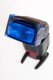
Colour Temperature: Blue.
 The colour of the lighting is also important to take notice of when observing the image due to be placed over the green screen. For example, if the subject is meant to be walking on a modern pier at night, while there may be lighting in the form of lampposts, it will need to be a cool light, so a CTB (colour temperature blue) gel may be placed over the light, in order to create the appropriate back light for the head and shoulders of the subject, while mimicking the lights that would be present on the pier.
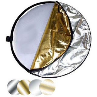


Light Reflector: A media student savior.


Another tool that is useful when working with green screen is a reflector. It is used to even out harsh shadows and give fill to the subject where needed.
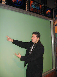


...I hope to God I'm pointing at England.

Although lighting is paramount (as you have probably guessed from this blog....) to the success of a green screen production, there are other things to take into consideration, such as how convincing it is that the subject is indeed at the location fitted over the green screen.

Youtube is full of clips making fun of the terrible use of chroma key in the 70's and 80's, where a weather man would perhaps point to Scotland and cheerily chirp about how sunny England was going to be on Tuesday. Or unknowingly dipping his hand into the Atlantic Ocean when consoling Ireland about the rain they were due to receive at the weekend.  That is not how you want your project to be remembered, graded or reviewed.
  
Tips to avoid embarrassment of this nature: If the location is windy, a fan may could used to create the effect of wind blowing through a subject. If the shot includes rain, it may be wise to put droplets of water on the subject's costume and hair (you will of course have to be careful if this is the case, being surrounded by so much electricity in a studio!). If there is action in the background, it may be worth experimenting with crew members waving their hands past the lights to correspond with the background. 
 Because I understand how frustrating chroma key can be to work with, I have some further short tips for you young film makers out there:
 
. Make sure a storyboard is in place so that the entire group knows what the aim of the project is, and what the background is supposed to look like.

. Use a shallow depth of field in order to control light spill.

. Avoid the characters on set having green clothes while working with green screen. Or blue clothing when working on blue screen...I am sure you can see where I am going with this.

. In regards to props, avoid shiny ones. Shiny props might reflect the green of the screens and give the characters a sickly look and the set a sickly hue.

. You cannot fix the lighting in post production when working with green screen, this is NOT the project for inexperienced lighting technicians to experiment and gain more experience! The light must be even and bright on every portion of the green screen material.

. The actual green screen itself must be taut and unwrinkled, in order to get the best possible results. If there are imperfections on the screen itself they will show up on the footage.

. Never place your subject right next to the screen. Move your subject as far away from the screen as possible.

Green Screen users of the future: I wish you luck and truly hope my article helped
Adieu. 
Louise.